Driven by favourable climate changes, English viticulture is a fast-growing industry and there are now over 140 vineyards in South-East England alone. With a bottle of English Sparkling Brut commanding a price of between £25-£35, it aims at the high-end luxury drinks market, and competes directly with the well-established champagne region.
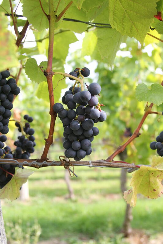
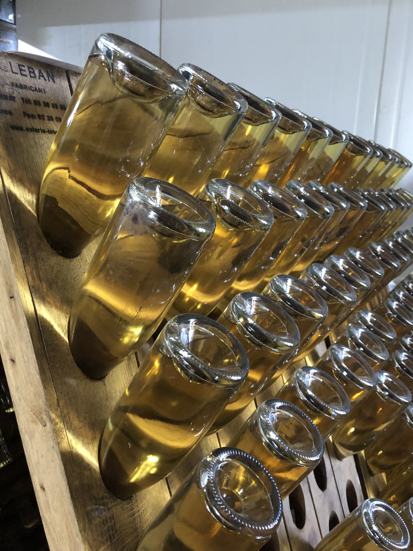
Brissenden is a small family run vineyard in the heart of Kent, with seven acres of established vines which produce a harvest of between 20 and 30 tonnes of grapes per year. The current owners relocated from London following a dream of country living and, by the time we met, they had spent four years learning the intricacies of running a vineyard. Every task, from maintaining the vines and harvesting, to bottling and labelling, is carried out by hand by the family and their small team.
The existing labelling had been created on a shoestring budget, and visually it didn’t compete with the established brand leaders or reflect the superb quality of the wines and cider in the Brissenden range. In addition, when the bottles were immersed in iced water to chill, the labels peeled off.
Carolyn Warren Marketing:
Marketing Plan
Jenny Preston:
Linocut Illustration
On this project I was working in collaboration with Carolyn Warren Marketing, and over several strategy sessions we uncovered Brissenden’s story and personality whilst establishing their vision, values, positioning, target audience and competition. To drive brand awareness and growth, we created a 360 degree marketing plan and determined that the brand needed be visually elevated, and executed consistently across all media and marketing tools, so its perceived as sophisticated, classy and warrants its premium price.
Existing customers were generally part of the local community, often connected to the vineyard through friends or family. The aim was to extend this audience to a wider Kent catchment area via farm shops, farmers markets, independent wine shops, trade fairs and through local restaurants and bars.
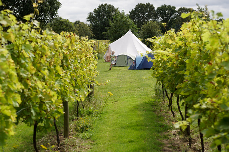
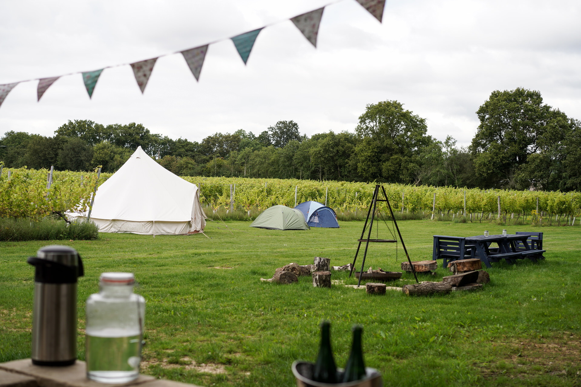
There was also potential to build upon the ‘vineyard experience’ by promoting wine tours, rental of the wine tasting room to drive incremental revenue and to include a campsite within the vineyard to enable customers to live ‘the Brissenden life’.

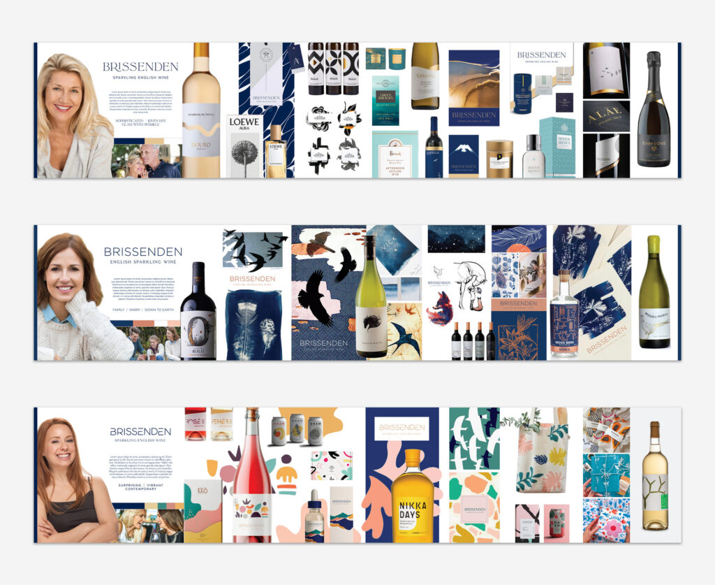

Using detailed audience personas, I was able to create three stylescapes to help to bridge the gap between the written strategy document and the creative design. By visualising the look and feel of the brand in terms of typography, images, colours and illustration styles, we brought the brand personality alive for the client which helped articulate who the core target audience was and the design direction for the logo identity and labels.
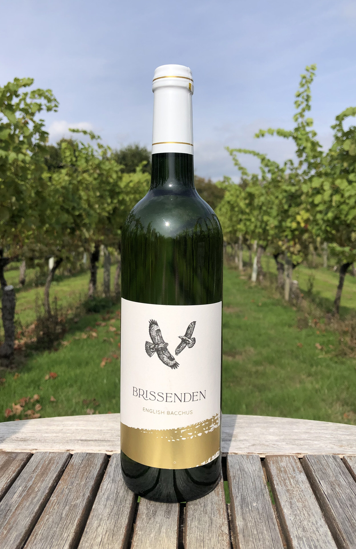
Using the stylescape persona as a cue, I presented several initial designs for a typographic logo identity, taking care to select typefaces which reflected the luxurious personality of the brand. The chosen design couples ‘La Luxes Serif’ (a classy serifed typeface with decorative ligatures) with the classic sans serif font ‘Proxima Nova’, and the extended swish in the letter ‘R’ and the stunted ‘I’ in the word Brissenden provide additional aesthetic character to the lettering.
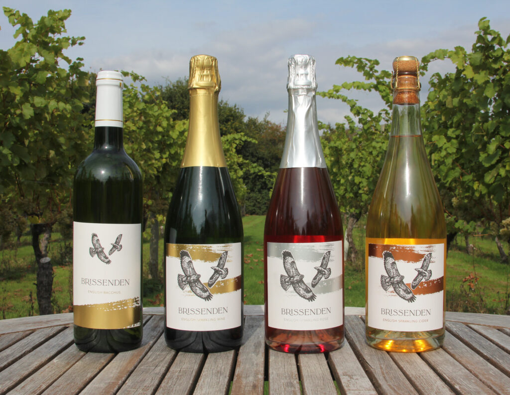
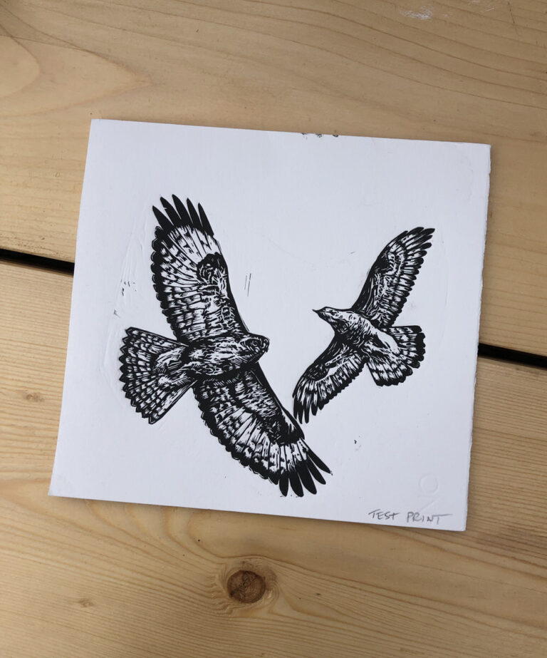
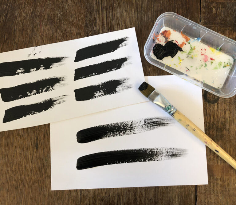
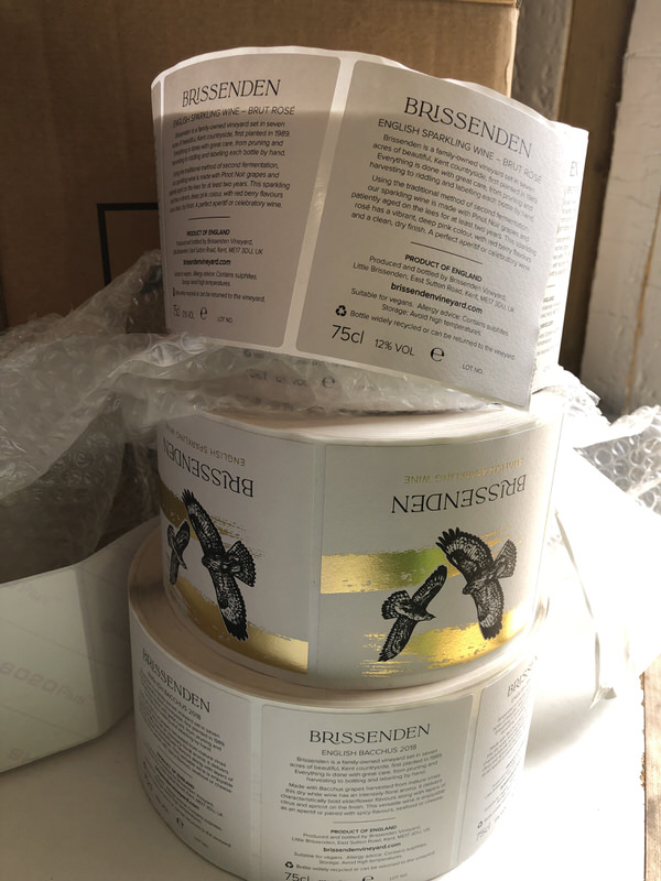
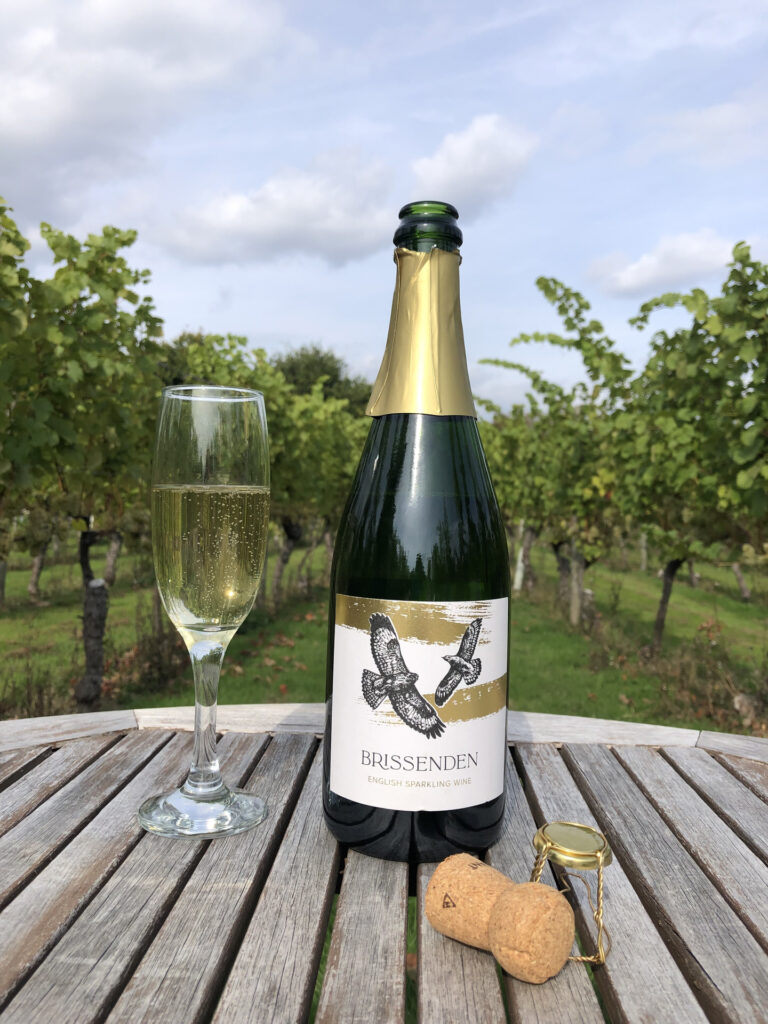
One of the characteristics of Brissenden are the buzzards which regularly hover over the vineyard, and the family feel that they protect the skies above them. It was decided to visually represent them on the labels, and several illustration styles were explored, including pen & ink, collage and cyanotype, before we settled on linocut. Local Kent artist, Jenny Preston, was commissioned, and the resulting linocut artwork represented the buzzards soaring majestically in flight.
The black linocut birds have been paired with hand painted brush strokes printed in metallic foil to introduce a loose artistic style and increase the sense of luxury. Each wine and cider label uses a different metallic colour (matched by the foil on the top of the bottle) which helps to maintain a visual consistency across the whole range. The design on the sparkling wine and cider labels features the birds prominently across two metallic brush strokes, whilst the still Bacchus wine has a taller label with smaller birds hovering over the landscape created by the gold brushstroke.
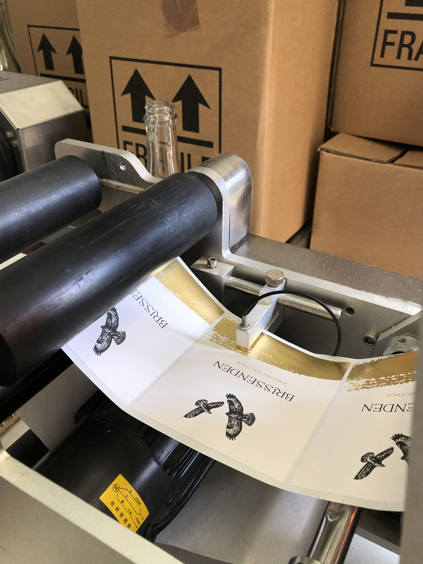
The print production required a specialist with experience of printing wine labels, and Inprint in Hove were recommended as they had printed labels for many other vineyards. They oversaw the entire print process, offering advice on cutter guides, foiling, stocks and adhesives to prevent the labels peeling when submersed in water.

When we first took over Brissenden in 2017, we were swamped with learning all the new skills required on a vineyard and keeping on top of those jobs. The first branding we chose was done at top speed and was always intended to be a short-term fix. A few years down the line and we were increasingly aware that our branding and labels did not reflect the quality wines that we were producing, and it was inhibiting us from pushing the product, especially through certain channels where first impressions matter most.
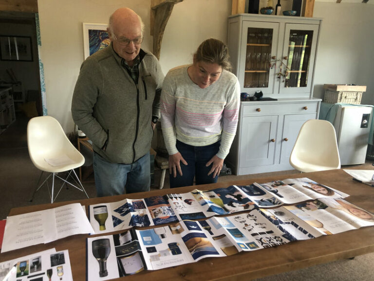
By bringing in the team of Fay at Phase One Design, and Carolyn Warren, we achieved our rebrand aim without our workload being too onerous at all. The hours we did spend were well structured and invaluable, as they helped the whole team reflect on what is important to us, and celebrate what we have already achieved. We are particularly guilty of underestimating the importance of this, and really benefitted from the sessions.
Prior to the project, we knew very little about the marketing and branding process, and Fay and Carolyn were very patient in talking us through the process. Once we had our core values, we were advised to ensure these were always at the centre of everything we did.
The ‘stylescapes’ Fay introduced us to were a great way to progress the design brief we needed. I struggle to visualise ideas before they are in front of me, and having different styles of branding, in keeping with the ‘bird’ theme we had decided on, organised into ‘mood boards’ was brilliant. We were able to identify which one felt right, and they helped further to fine tune exactly what we liked and disliked for our own brand, and was the basis from which we created our design brief for our artist. The session was really fun too!
It has been a pleasure working alongside Brissenden on such a transformative brand project. The rebrand has catapulted their brand proposition and visual identity giving them the strong belief and credentials to compete visually with the brand leaders in the English viticulture industry. As a result, they are now confident and ready to launch their brand.
Marketing activity will be focused on driving awareness of the brand online and via social media and PR. New distribution outlets such as farmers markets, local stores will be targeted, as well as exploring partnerships with local food producers and caterers. In parallel they will look to grow existing sales routes and expand their range within them.
Over the Summer the first visitors to the campsite have been welcomed to enjoy the unique experience of camping among the vines whilst living and tasting the Brissenden life.


Throughout the whole branding process, I found Fay thoughtful and kind, yet also authoritative. She listened to our opinions, gave us a focused but good range of choice, but wasn’t shy of giving us her own experienced opinion either. It was great to have someone whose artistic taste you trust to consult on every little detail such as foil colour for the different wines. It meant that we loved the resulting labels, had chosen all aspects of them ourselves, but all through Fay’s clever guidance that ensured those aspects worked well together and represented us best. We are thrilled with our new labels.
Working with Carolyn and Fay together was brilliant. There is so much overlap between the two areas of marketing strategy and design, it was great to get both perspectives on all aspects of the business, and saved us lots of time too.
If you feel you need a fresh look, and to have more of a plan about where your business is headed, then we definitely recommend working with Fay and Carolyn, it has transformed us and we have already had wonderful feedback on the new look.